Girls Club Magazine
Editorial Direction, Visual Archive & Print Craftsmanship
Project Overview
Girls Club is an independent, 56-page visual publication conceived as a tactile raw archive. Moving away from ephemeral digital feeds, the project materializes as an artistic artifact exploring the intersections of contemporary youth culture, female creative collectives, and analog visual documentation through deliberate pacing, experimental layouts, and exposed physical bookbinding.
01. Visual Research & Editorial Benchmark
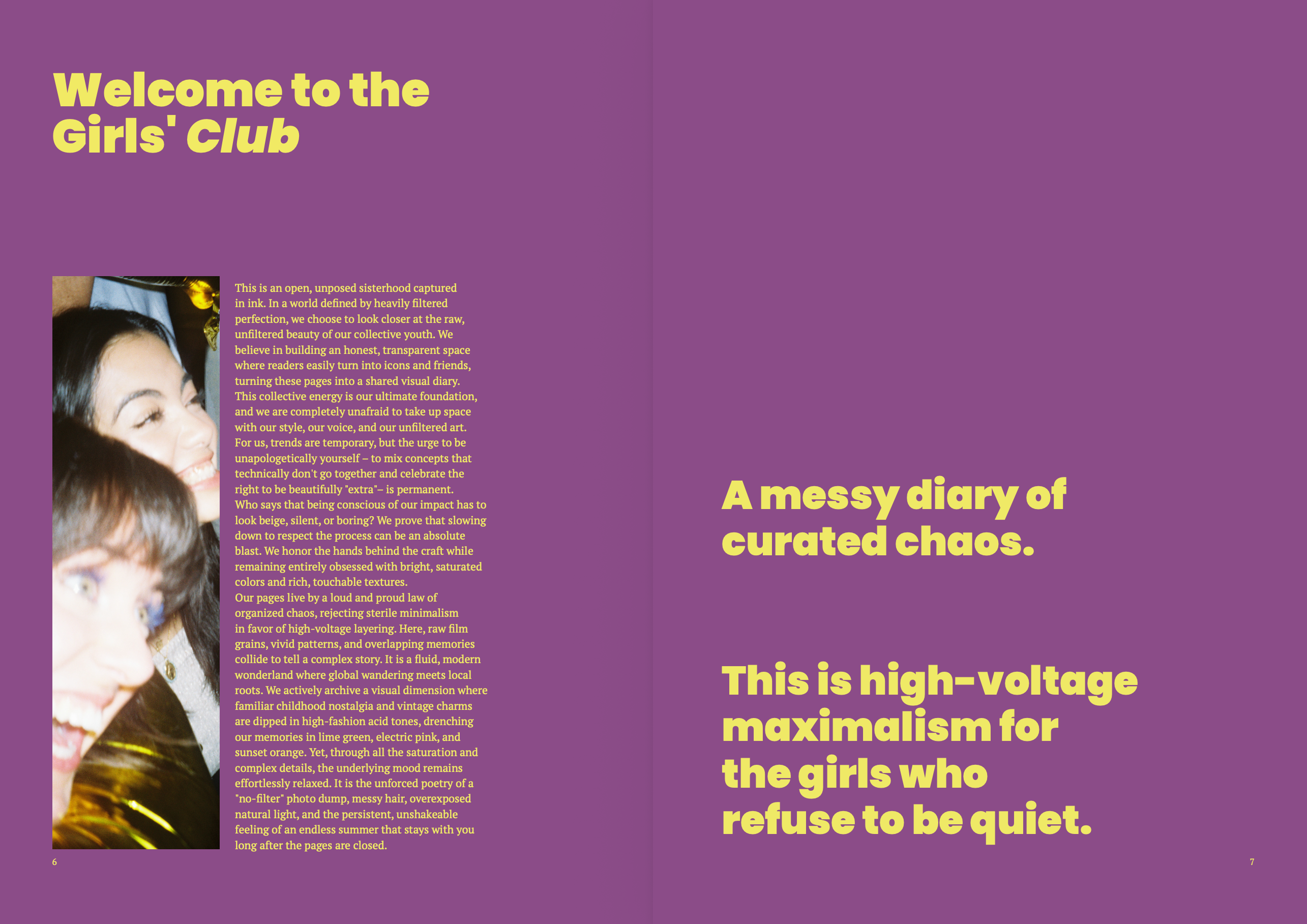
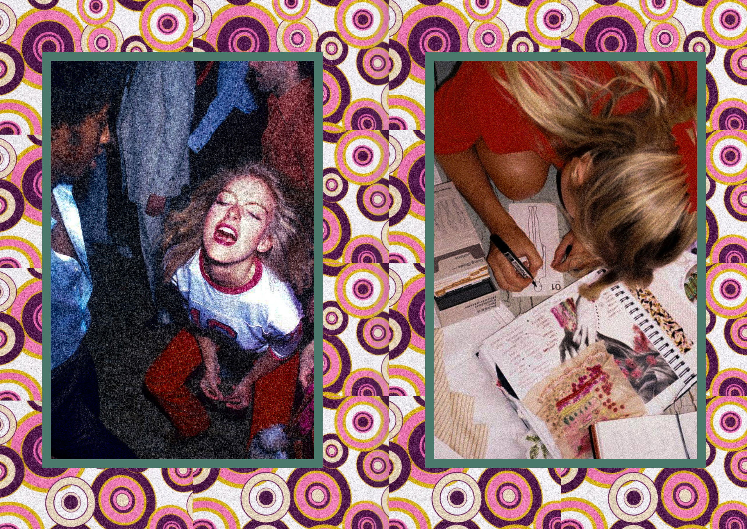
A deep curation process examined experimental independent zines, fashion monographs, and brutalist publications. This research underscored the need to move beyond conventional glossy magazine structures, adopting an raw, maximalist editorial framework where candid photography, spontaneous archival material, and expressive rhythm take precedence over rigid corporate layouts.
02. Concept: The Raw Collective
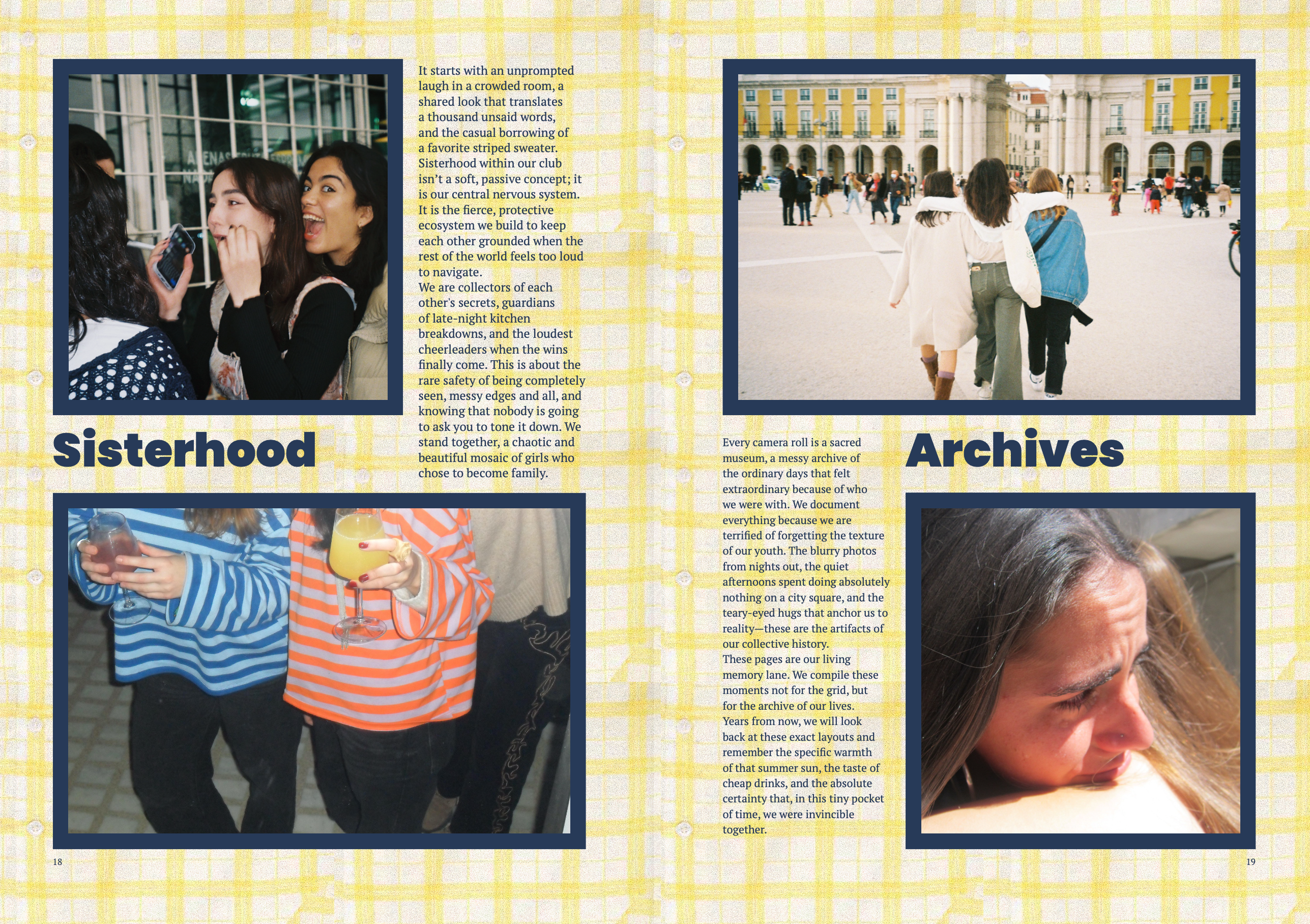
The editorial philosophy is rooted in raw authenticity, creative camaraderie, and tangible memory. The publication functions as a collective exhibition space - treating every spread not as a passive display of content, but as an intimate tactile diary that juxtaposes personal visual archives with bold typographic statements.
03. Editorial Grid & Layout Dynamics
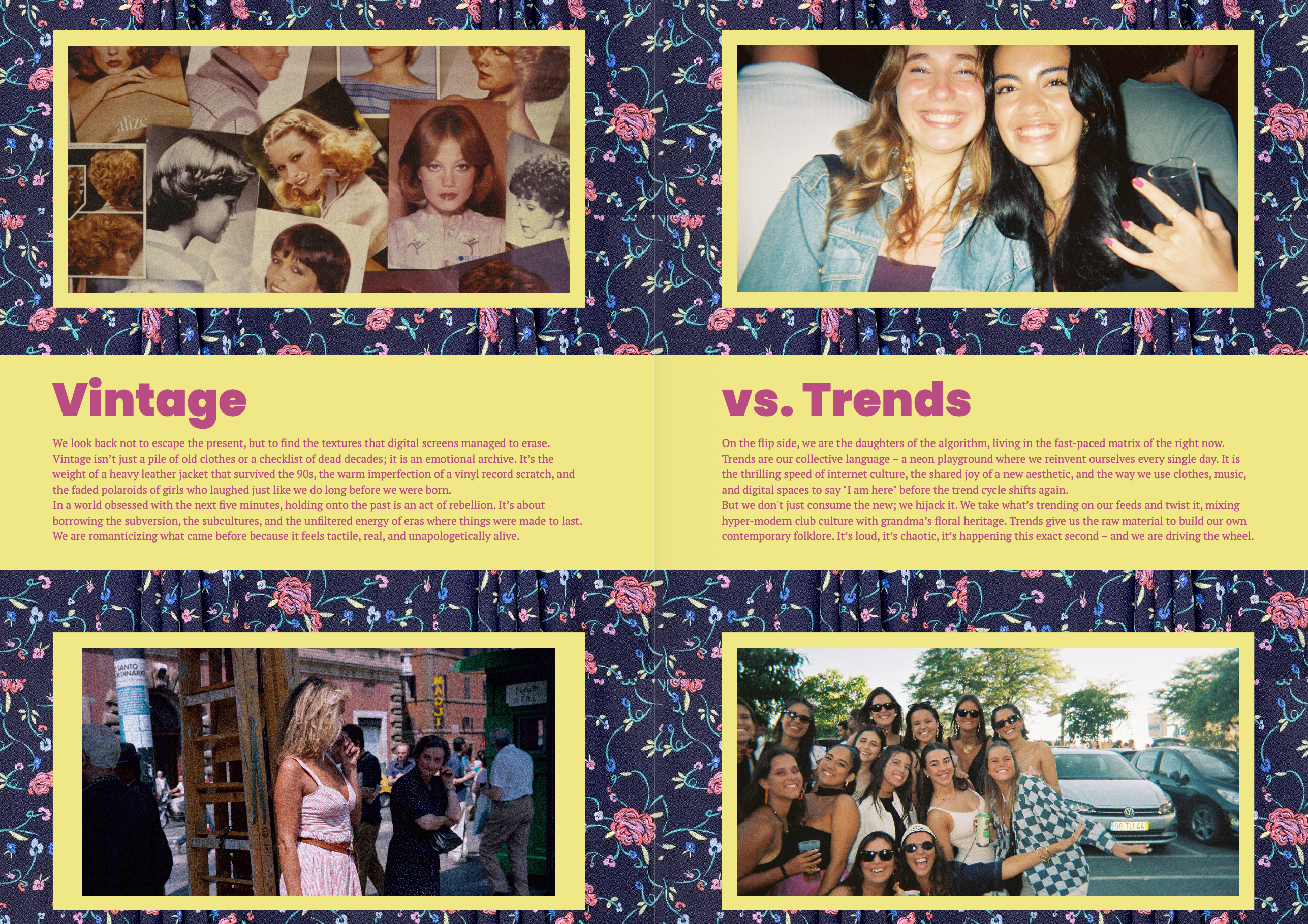
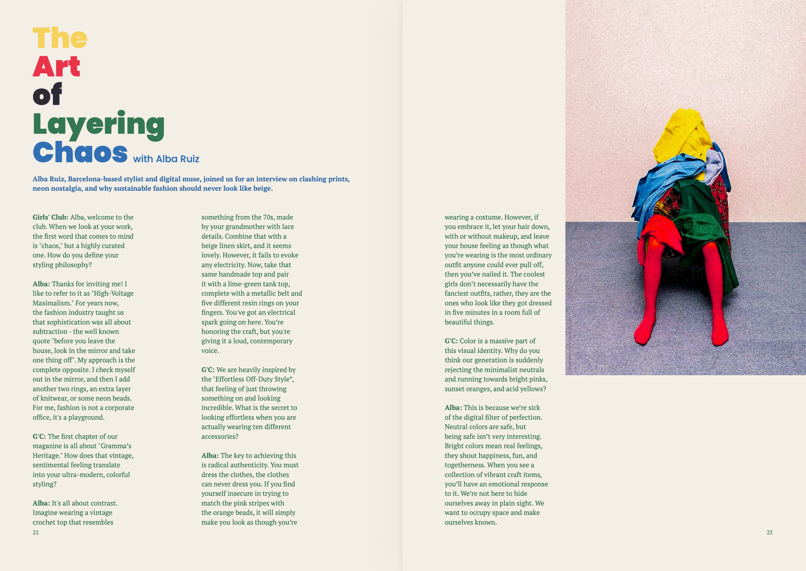
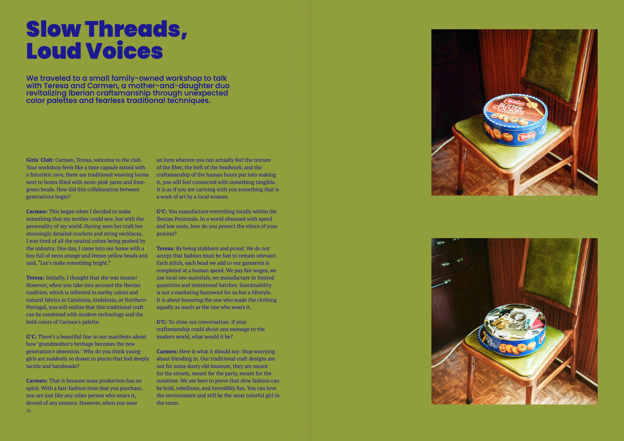
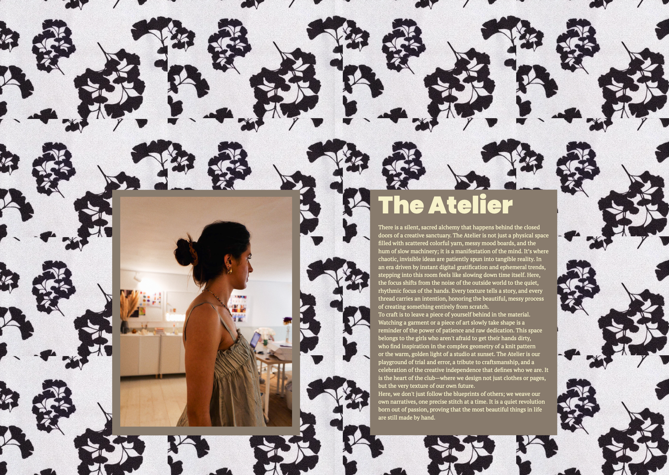
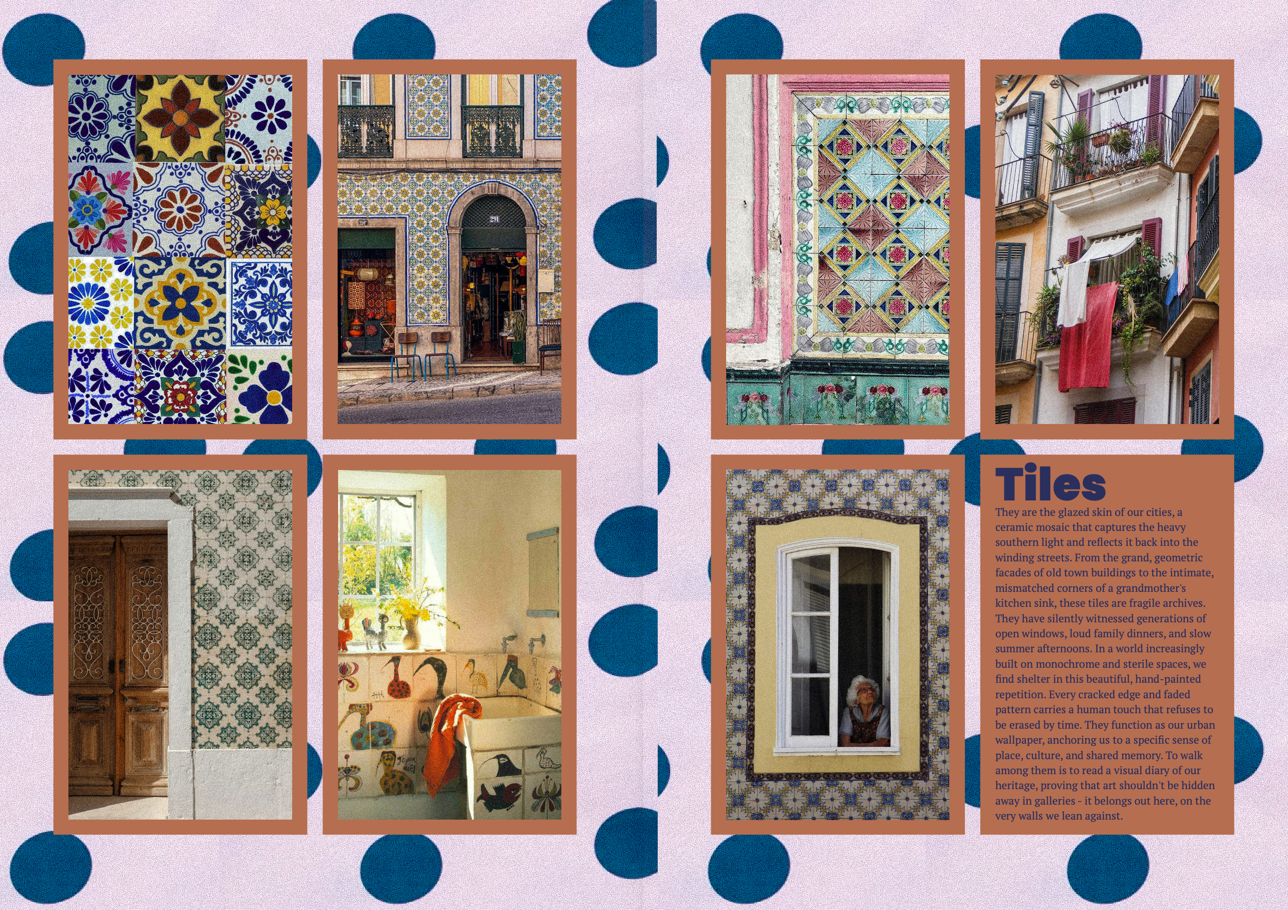
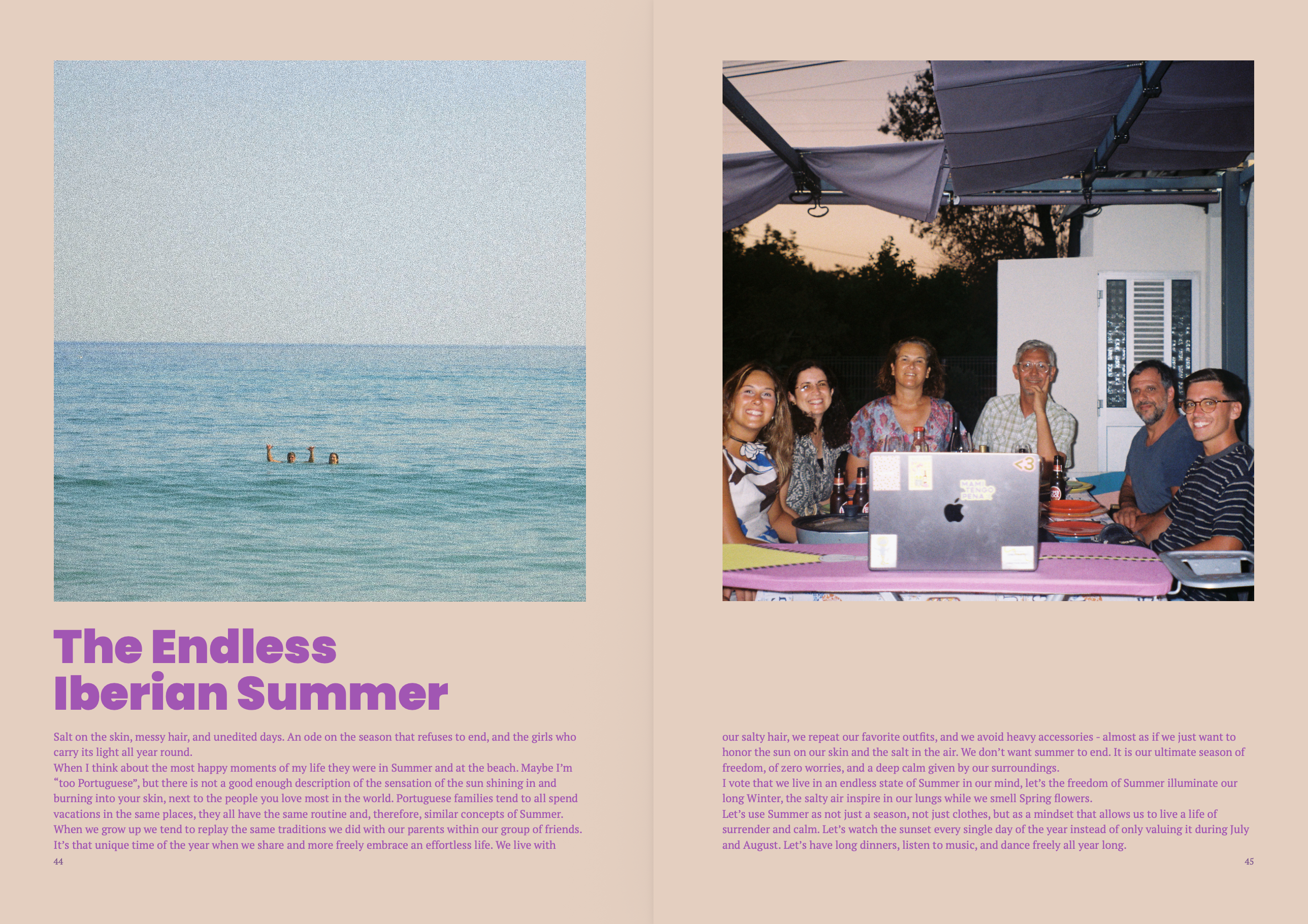
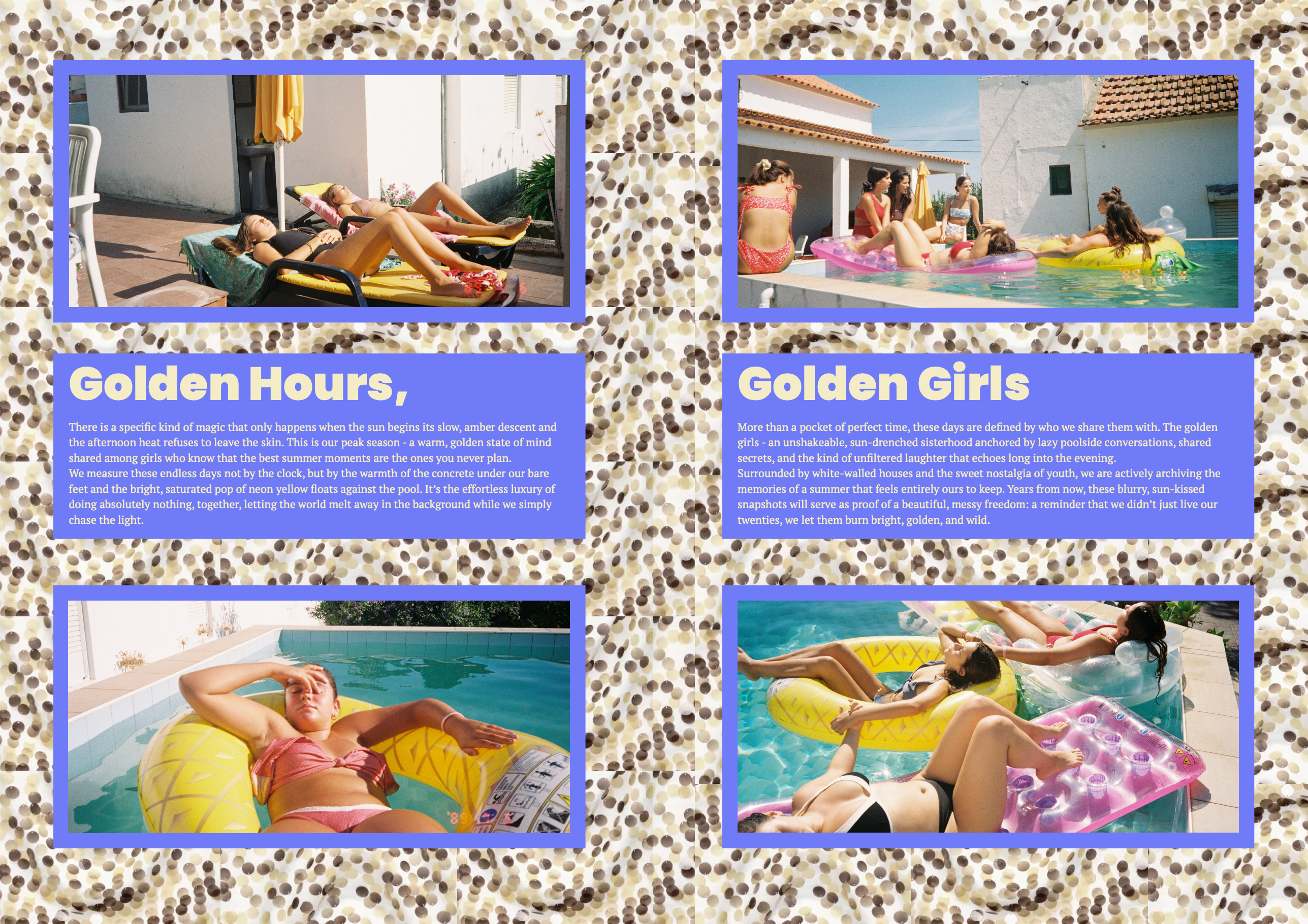
The 56-page architecture relies on a multi-column modular grid designed to alternate between disciplined structure and deliberate disruption. Rigid text modules and technical indices continuously clash with full-bleed imagery, asymmetrical margins, and negative space, establishing an intentional visual tempo that slows down the act of reading.
04. Chromatic Strategy & Typographic System
The color palette explores high-contrast dialogues, pairing tender pastel hues (Nude Peach #ECD1C8) against electric acid accents (Carmine Pink #E83964, Mint #39E8BD, and Cobalt Blue #1F4A75). The typographic identity anchors heavy, geometric brutalist forms (Poppins Black) alongside functional, clean grotesque body types, generating striking hierarchy across massive headline compositions and technical credit blocks.
05. Print Engineering & Exposed Binding
Engineered for tactile interaction, the publication is printed on uncoated 150g stock and assembled in 4-page signatures with open, visible white-thread Smyth sewing. A flexible 300g wrap-around softcover protects the body without adhesive on the spine, celebrating the mechanics of bookmaking and allowing full 180º flat-opening display.